Small Art
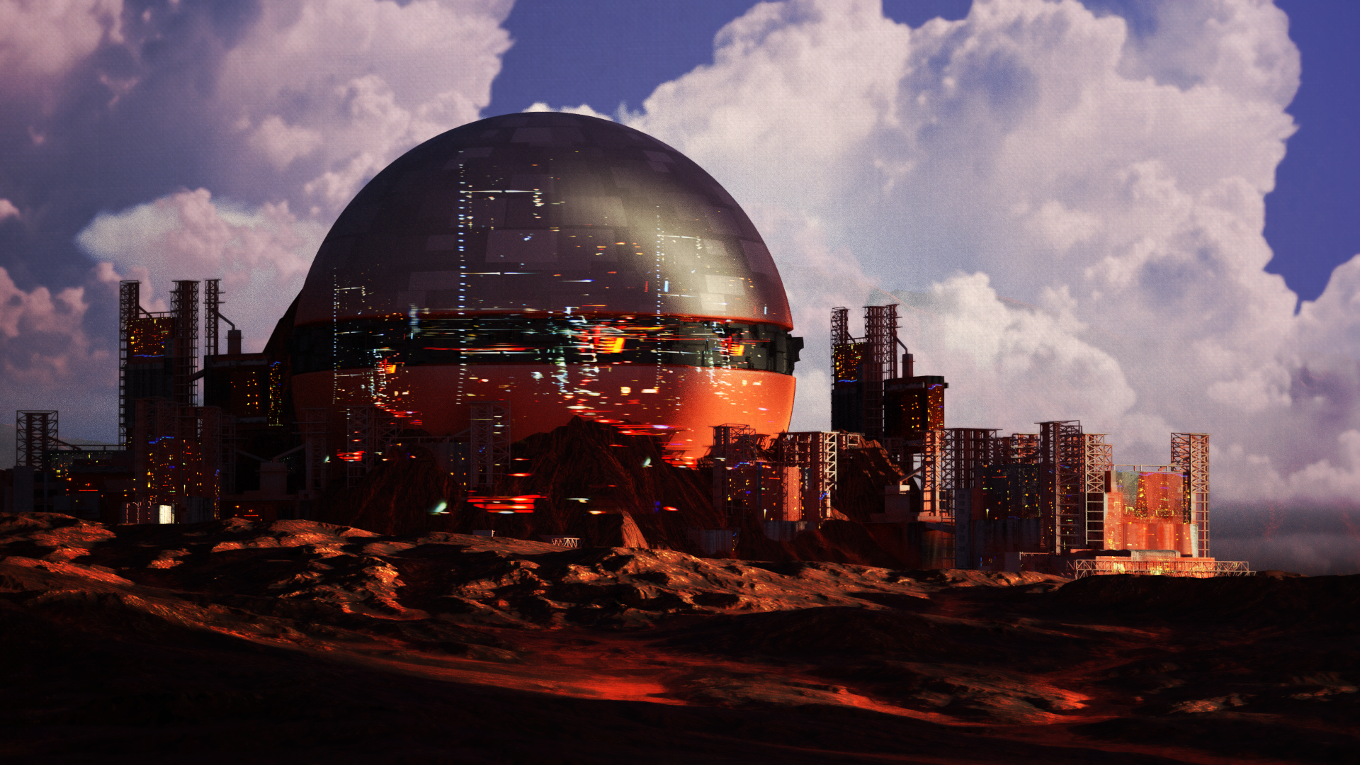
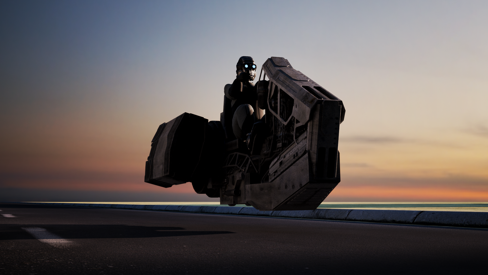
Over the past week I've done a couple renders, not part of any larger universe or project at the moment. Doodles really I guess. My main focus on the final render was being more conscious with my composition, and really utilizing light and shadow to guide the eye. I've definitely sabotaged renders in the past by focusing on showcasing the model I made, instead of thinking about how to make the best image.
Here's a quick little pic of the hoverbike from another angle that shows the model more.

Both of them were pretty quick, the dome city uses some old buildings I made for another project that I never finished, and the hoverbike is a simple kitbash with a character I made way back during the daily art project 2-3 years ago now. I'm probably overdue making a new generic scifi-dude to put in art. I'd like to think my character work has evolved some since then.
Looking at it with fresh eyes now, I think the bike color is boring, I should have made the painted sections more vibrant.

I think the saturation contrast actually brings your eyes straight to the focal point now, and while it was easy to sort of view it all as one blob, and gloss over it before, the orange kind of leads your eye around in a loop. Now that the larger painted areas are sufficiently different from mechanical greeble bits, they're also places for the eye to rest, while before it all ready as one big noisy blob.

Heres the original angle, minus all the post proccesing color adjustments and vignette.
Anyways, after I did the hoverbike, but before I did all those adjustments just now while writing this, I also made this ship. Here's some progress pictures.
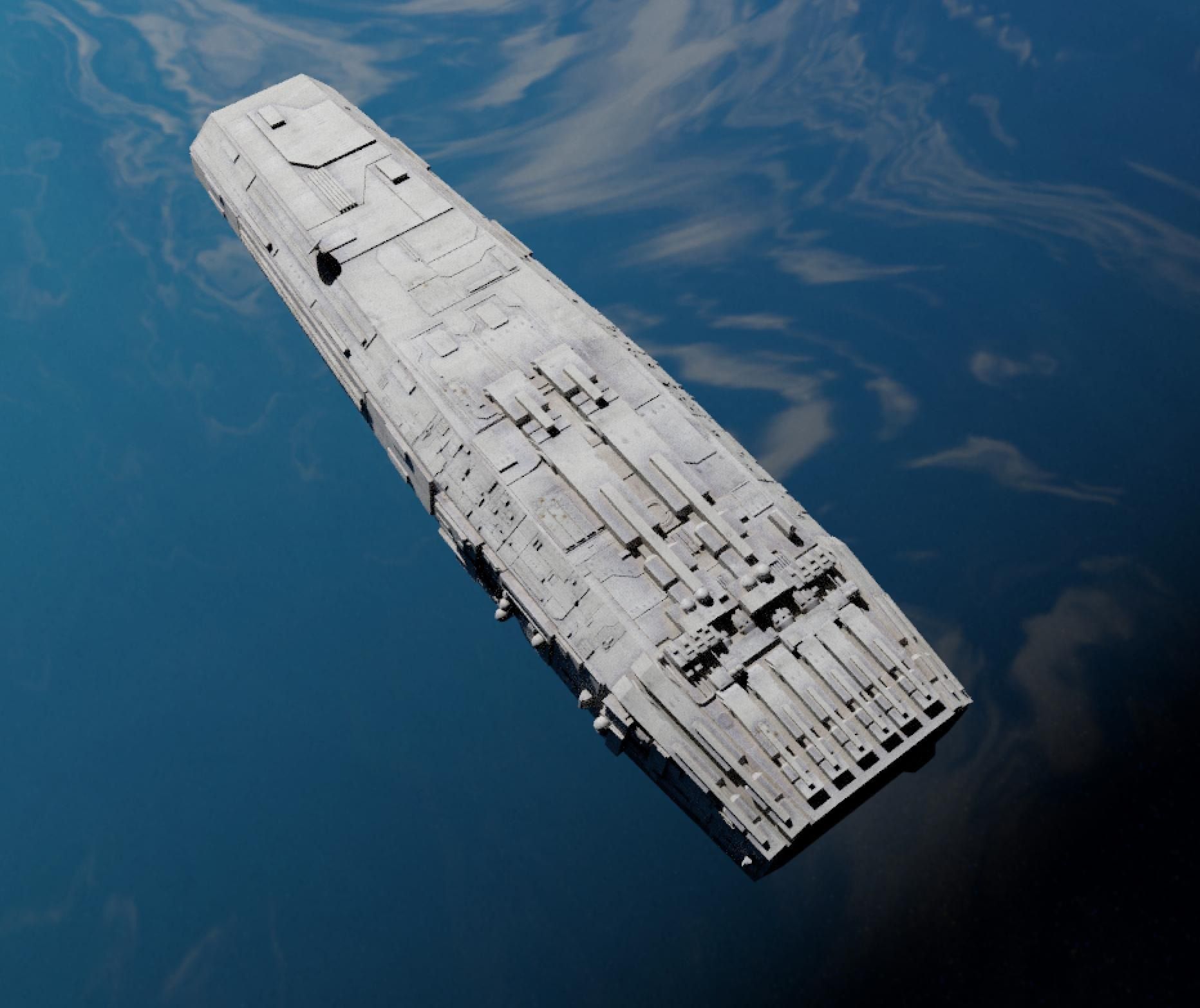

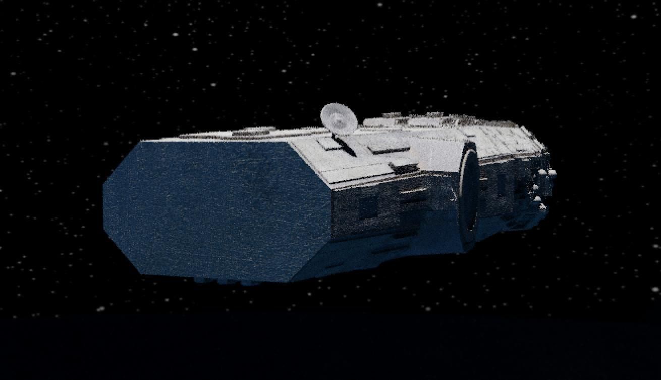
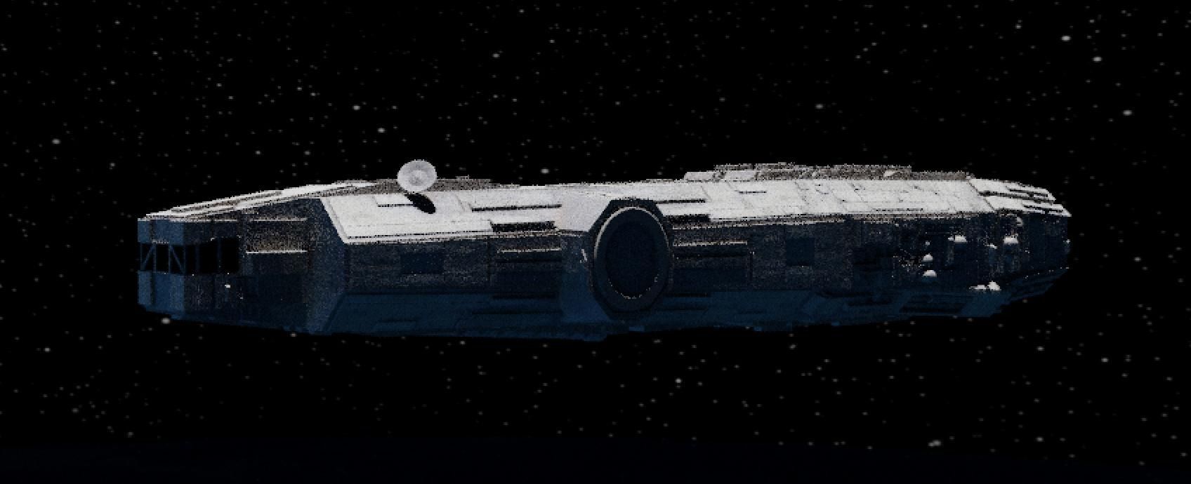


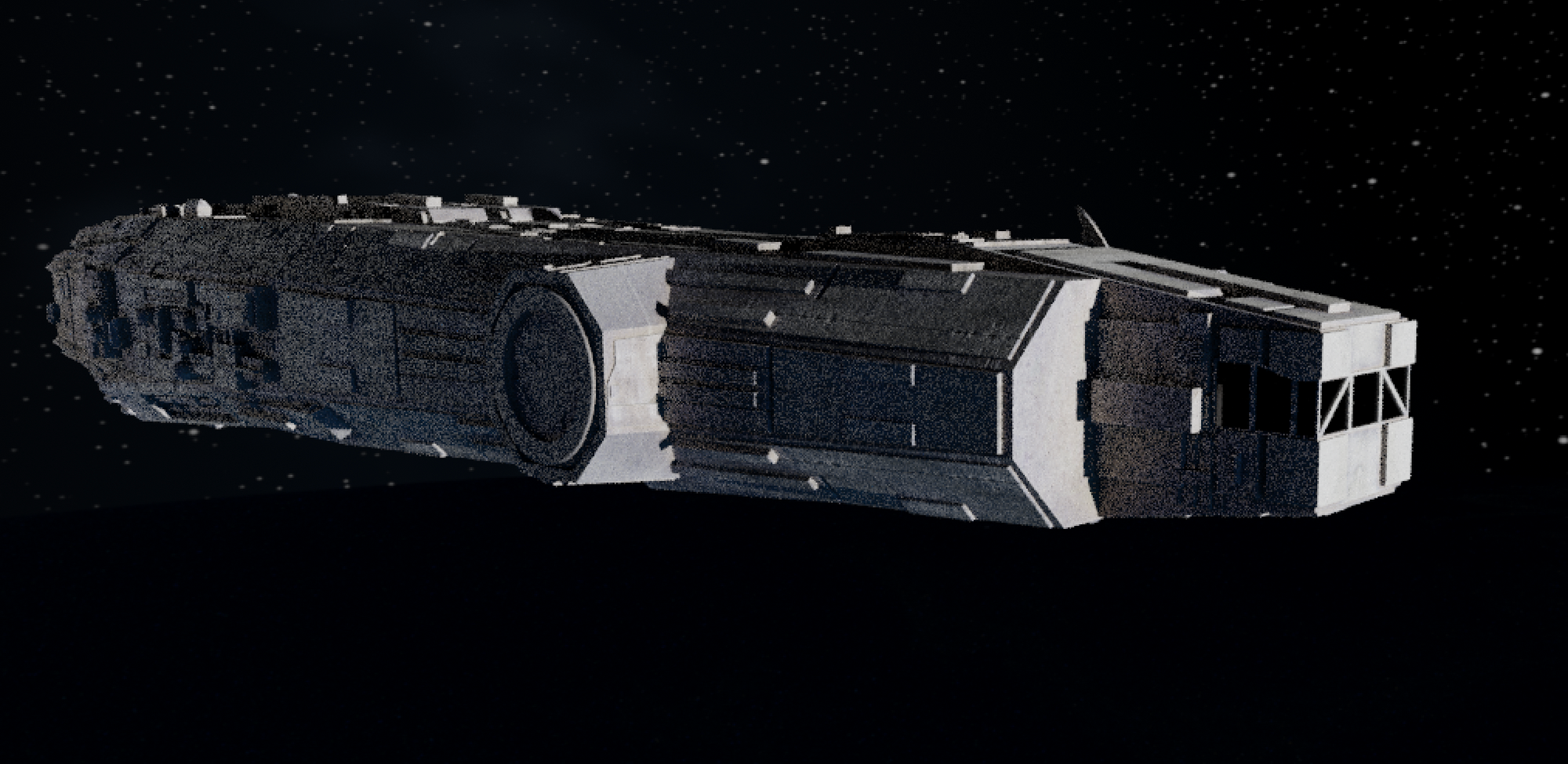

It may or may not be finished. I'm not really too happy with the cockpit, so I might redo that. While I was working on that, I was annoyed by how flat my space HDRI's clouds are on that blue planet, so I decided to make a new space HDRI with better clouds. Heres the current state of it, not sure I'm finished with it, but I like the clouds a lot more. Way less flat, and they cast shadows on the surface.

Originally it was going to be a desert planet, but I made my desert planet texture atleast twelve years ago, and even after upscaling it, I didn't think the quality was acceptable, not without going in and painting over some old mistakes, and I was ready to go to sleep, so instead I slapped in a high res earth texture from NASA, and messed with the UVs a bit to make the only continent visible look less recognizable.